


The Organic Brand That Actually Sells Organic Products
Organigram is the newly launched organic food company that produces and sells APEDA-certified 100% organic food like pulses, grains, and spices for health-conscious individuals.
The founders of Organigram, Mr. Nitin Gupta and Mr. Narayan Dutt, approached us to lay out a strong foundation, set a vision, and design their brand.
From brand foundation to verbal and visual strategy, we created a distinct identity that separates them from the rest of the competitors and builds an emotional connection with their ideal audience.
Scope
Brand Workshop
Brand Strategy
Brand Identity Design
Brand Messaging
Packaging Design
Social Media Templates

The Challenge
The Biggest Problem in the Organic Industry
Organigram founders approached us to create their brand from the ground up. We discovered the biggest problem in the Organic food industry, and it's the claim of "organic," "natural" or "pure" without any proof of it. Misleading people and harming the health of consumers.
The challenge was to help them
• Build the foundation and market positioning of the brand.
• Develop a brand narrative that emotionally engages the audience and builds trust with them.
• Stand out from well-established competitors.
• Design a distinct visual identity that represents the brand's personality, attracts consumers, and remains consistent across multiple touchpoints.
• Designing distinctive packaging bags for the products.
• Develop a strategy to present on social media.


The Solution
Organic Food With Complete Transparency
To help Organigram achieve its goals, We conducted a brand workshop with the founders to discover the brand and researched competitors' brand strategies, and target audience behaviors. We then strategized and built:
• A brand with the vision of making organic food affordable to everyone and promoting sustainable farming, enabling everyone to live a healthy and happy life.
• With better market positioning by emphasizing transparency and honesty values. This was accomplished by publishing lab-test reports online and organic authentication batch numbers on each food package, thereby increasing trust with the audience.
• Points of differentiation from competitors and built emotional connections by stressing the importance of organic certifications. Additionally, we designed friendly visual and vocal vibes that resonate with the caring nature of people

Through a collaborative workshop with Organigram founders, we uncovered the problems and challenges in the organic food industry.
With multiple exercises and extensive discussions, we found out the deeper reasons for their existence, the change they want to create with the values they care about, and ways to differentiate them from established competitors.
What we did
• Founders’ Workshop
• Brand Core Discovery
• USPs and Differentiators
• Brand Personality Exercises
• USPs and Differentiators
• Brand Personality Exercises
• Target Audience Identification

Brand Discovery Workshop
Brand Analysis
Audited Organigram's direct and indirect competitors, including their brand strategies, brand positioning and personality, and marketing strategies, evaluating strengths and weaknesses.
This analysis helped us understand industry norms and create a differentiated and true Organigram brand strategy, positioning, personality, messaging, and points of differentiation. This ensures that consumers can easily distinguish Organigram from other brands.
What we did
• Competitors’ Brand Analysis
• Competitors Marketing Analysis
• Competitors’ SWOT analysis
• Competitors Marketing Analysis
• Competitors’ SWOT analysis

Visual Analysis
Likewise, analyzed competitors' visual strategy and assets—the logo, colors, typography, marketing materials, social media, etc.
This later helped in designing the differentiated visual strategy of the Organigram.
What we did
• Market Research
• Visual Strategy Analysis
• Visual Strategy Analysis

Competitors' Visual Analysis
We created a detailed customer persona that identifies demographics and psychographics, as well as addresses their problems, challenges, motivations to purchase, and everyday behaviors.
Organigram's target audience is conscious individuals, parents, and guardians who prioritize the well-being of both themselves and their families.
What we did
• Audience Analysis
• Ideal Customer Persona
• Ideal Customer Persona

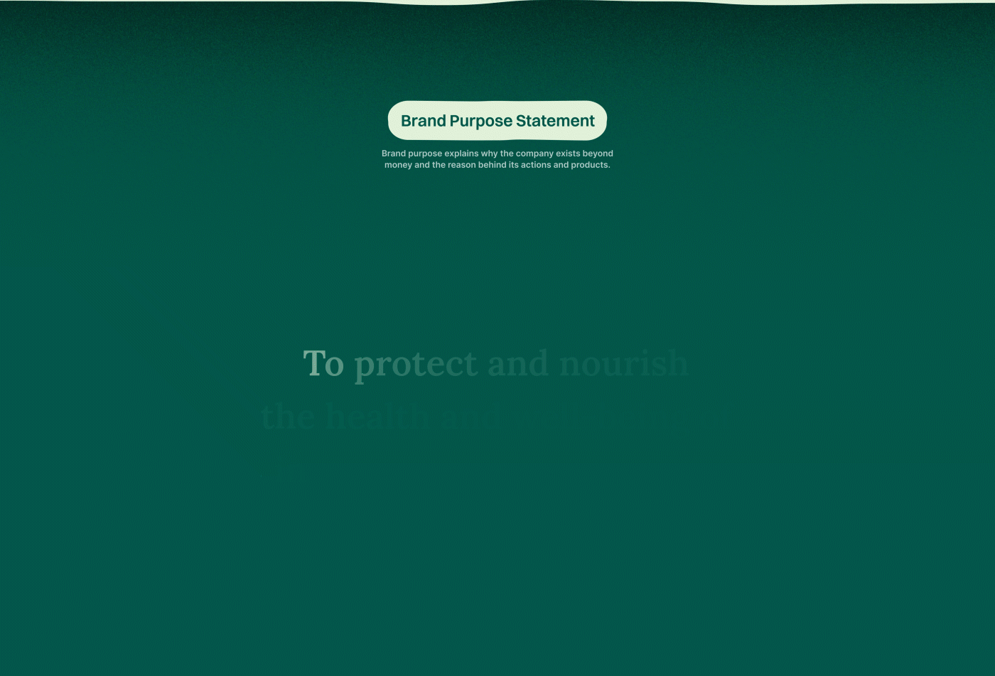
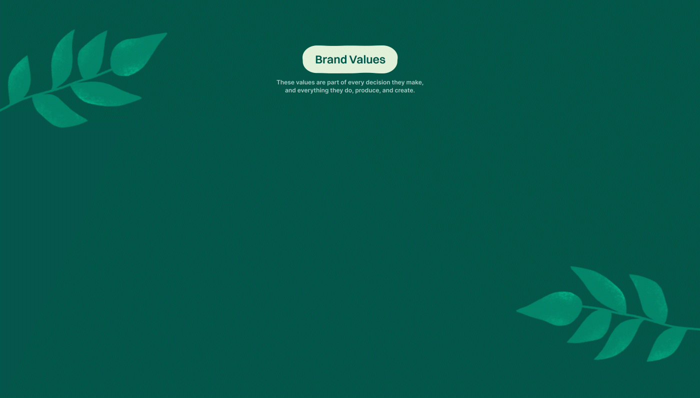
Our strategy set the core of the Organigram. Their purpose beyond making money, mission, values, USP, differentiating factors, and market positioning are all established. Their mix of caregiver and hero archetypes gives them a distinct yet relatable personality, tone, and voice.
Their brand is built on the belief that everyone deserves pure, tasty, and healthy food.
They are against the false claims and campaigns of purity and nature, which is unfortunately the norm in the organic food industry.
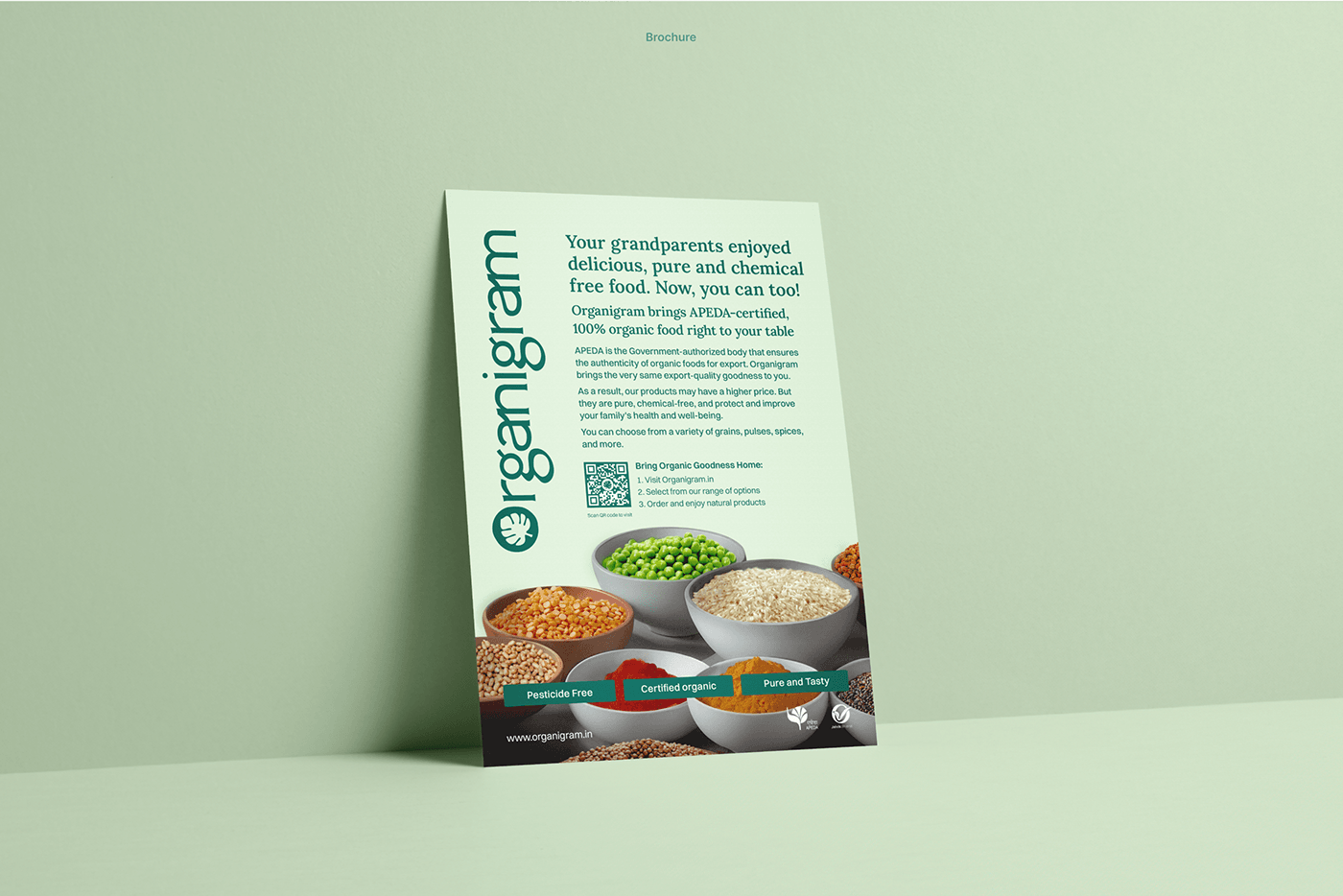
To uphold their value of transparency, they publish the lab test reports of their food on their website, ensuring that they are 100% natural every time.
Every plan and every decision is based on a vision of making organic living so prevalent and accessible to society that the term "organic" becomes redundant. Resulting in healthier people, natural farming practices, more fertile lands, increased safety for farmers, and a safer planet for all.
What we did
• Purpose, Mission, Vision Statements
• Internal and External Values
• Brand differentiators
• Value Propositions
• Positioning Statements
• Archetype/Personality
• Voice and tone guidelines
• Key Messages
• Brand Narrative - Tagline and Pitch
• Internal and External Values
• Brand differentiators
• Value Propositions
• Positioning Statements
• Archetype/Personality
• Voice and tone guidelines
• Key Messages
• Brand Narrative - Tagline and Pitch
Verbal Expression
Brand Messaging
We merged two archetypes together- caretaker and hero. This gave them a unique personality, voice, and tone.
It's recognizable and relatable.
Through this vocal strategy, they can show their care for their customers, farmers, and environment and challenge the ill practices in the farming and organic industry.


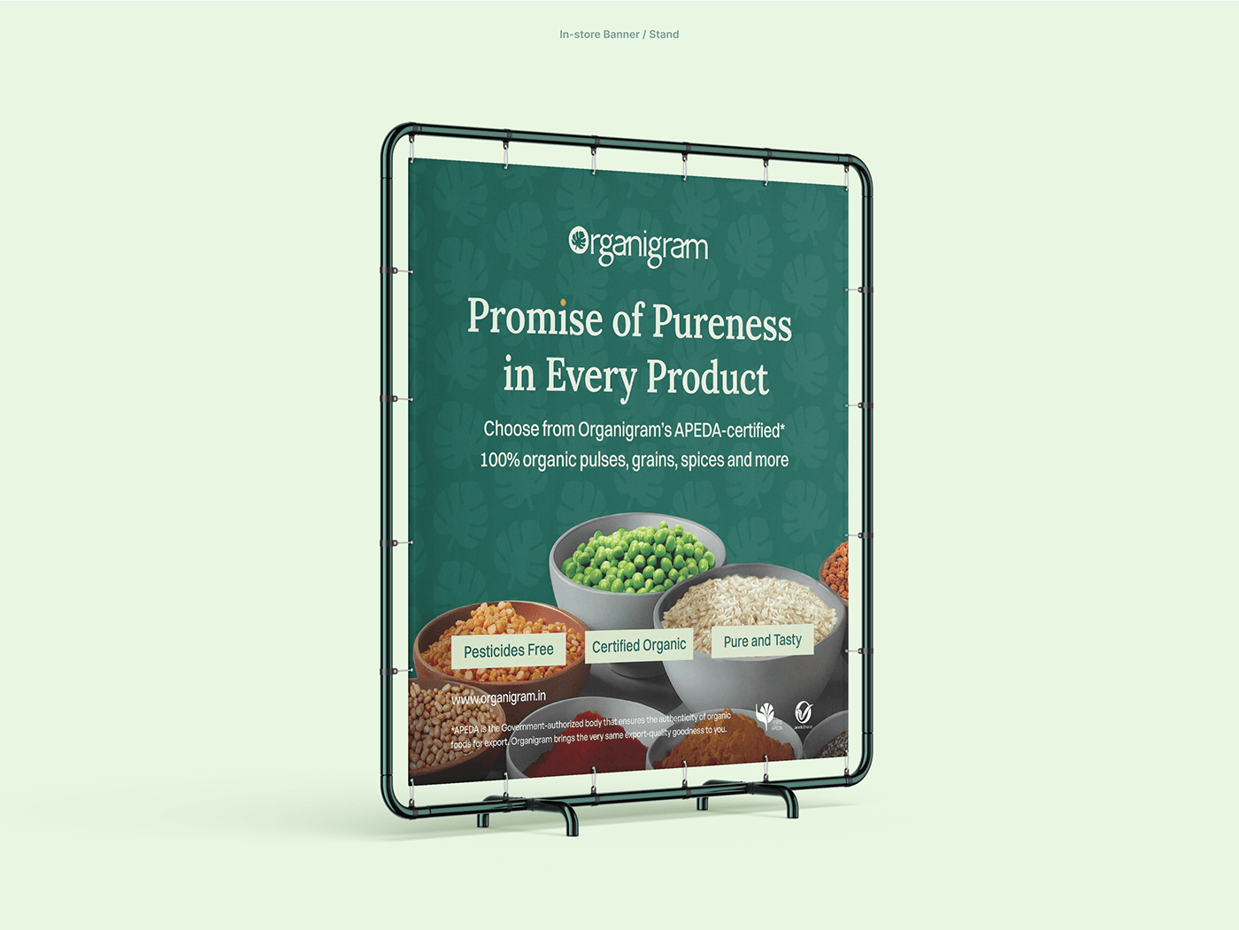
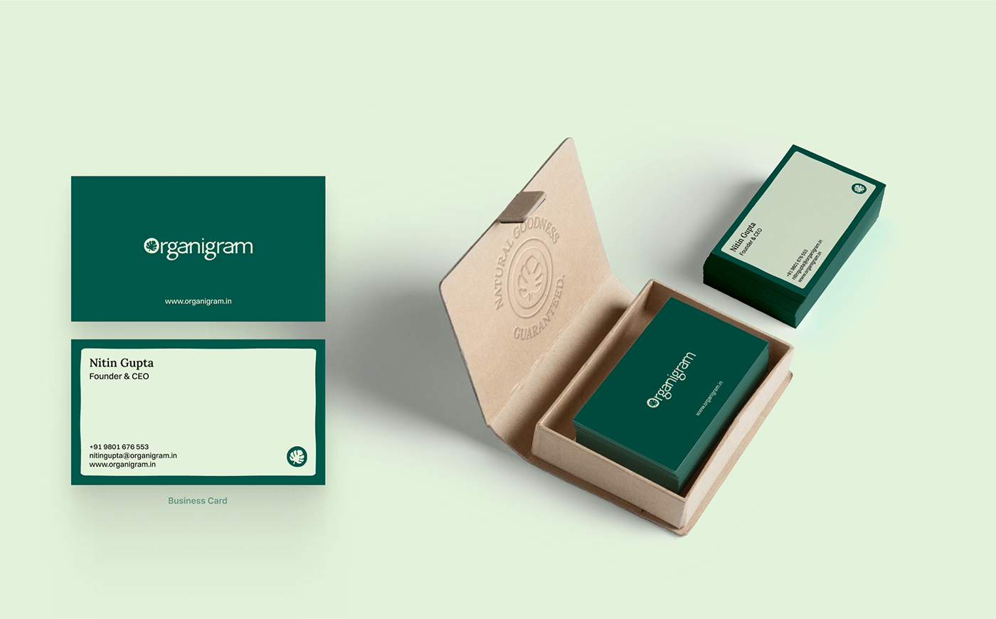
Brand Tagline
Natural Goodness, Guaranteed
This tagline captures the essence of Organigram, and also its promise of purity and naturalness, and its point of differentiation from any other brands.
Also acts as a base to create multiple other slogans to be used in various messaging.

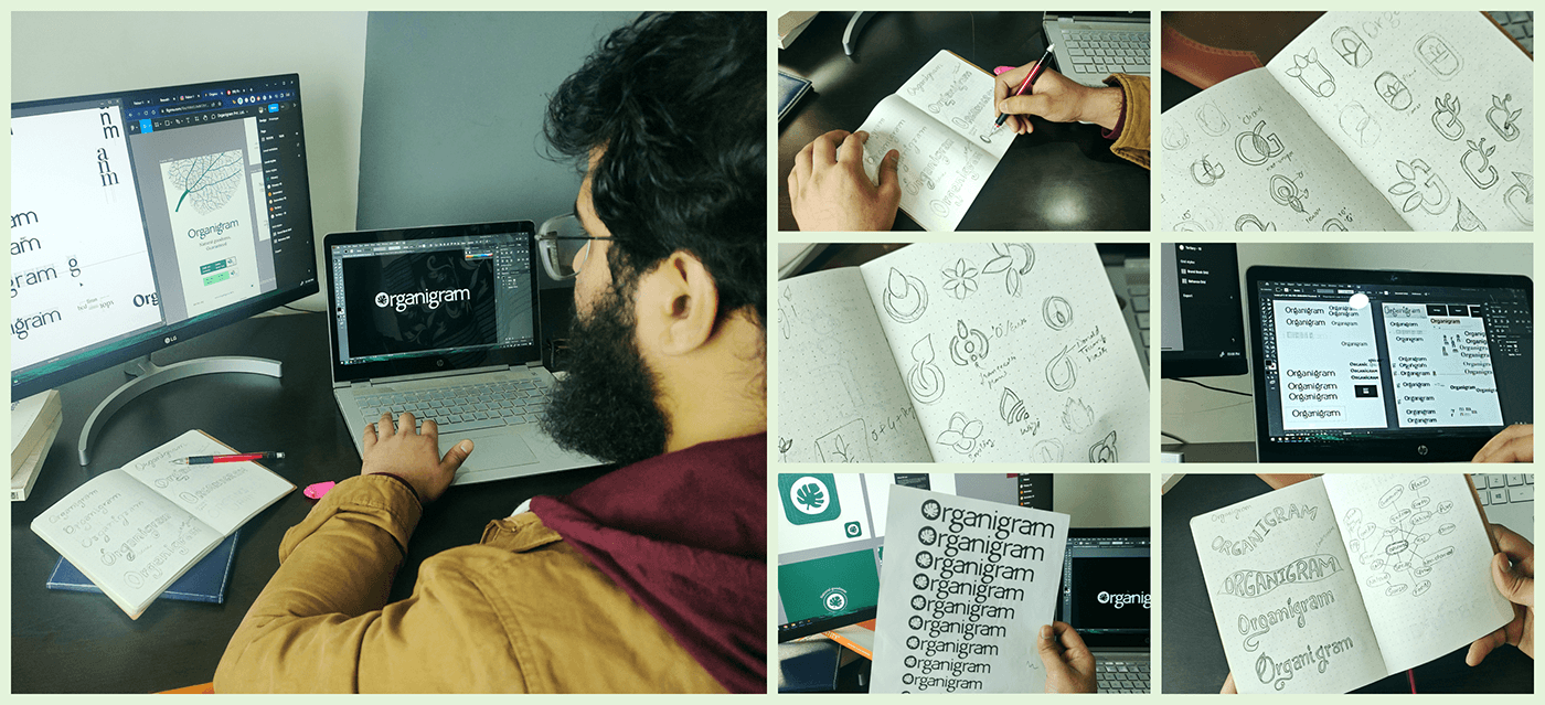
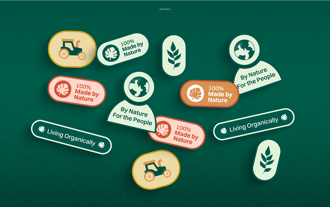
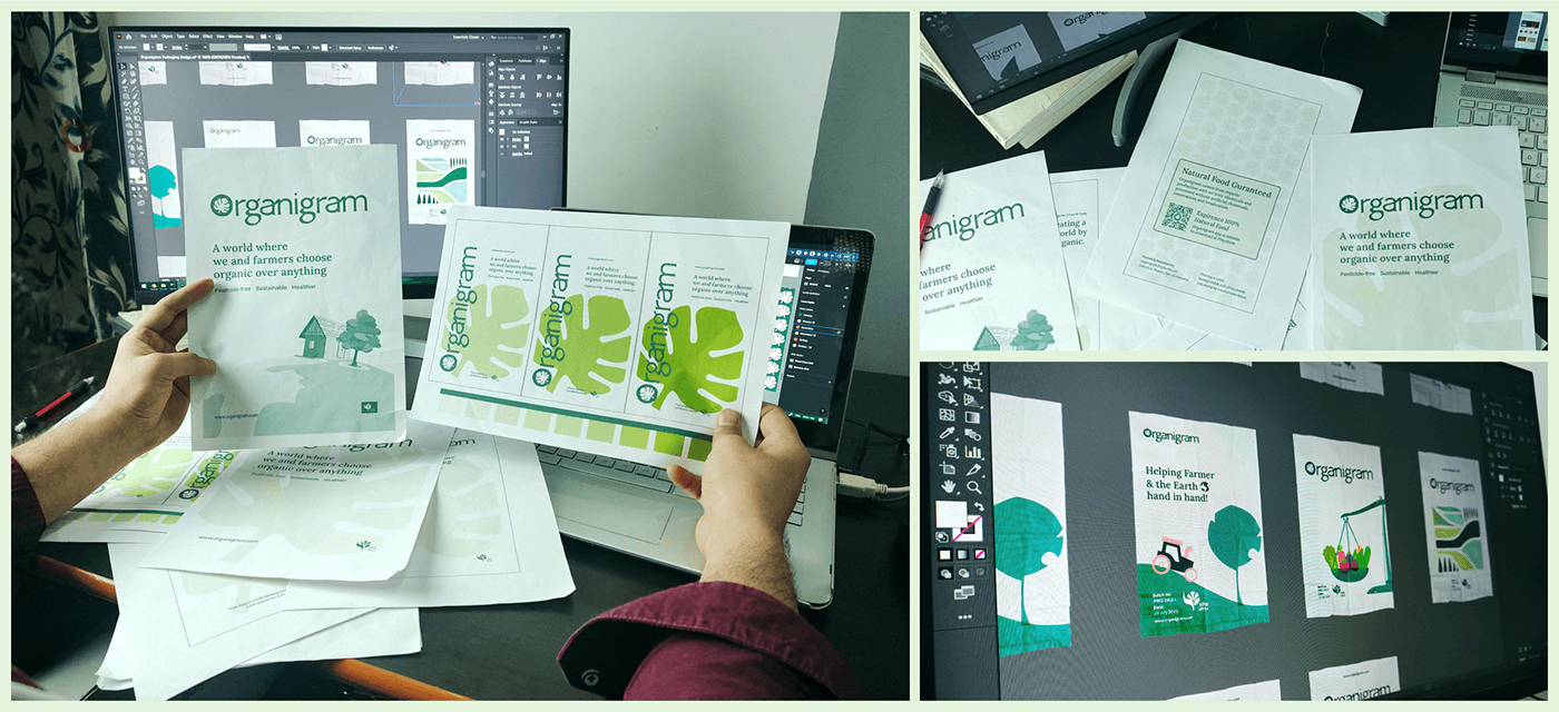
To craft a distinct Organigram's brand visual design, we based it on its brand strategy. Hand-drawn lines are part of the identity of the design that gives a non-industrialized feel synonymous with nature.
The customized logomark features a distinctive mark—a hand-drawn "O" adorned with a leaf inside. This icon represents the natural, premium, and friendly personality of Organigram, creating a recognizable and memorable symbol.
The color palette relates to the farming practice and fresh food, invoking a sense of joy and building a positive connection with the brand.
What we did
• Mood Boards
• Logo System
• Typography System
• Color System
• Patterns System
• Visual Brand Guidelines
• Logo System
• Typography System
• Color System
• Patterns System
• Visual Brand Guidelines
This wordmark, Organigram logotype, combines the letter “O with a leaf inside” with the remaining letters to form the full brand name.
This wordmark is the key element of Organigram’s identity and represents the organic, premium, yet friendly personality.
This wordmark is the key element of Organigram’s identity and represents the organic, premium, yet friendly personality.

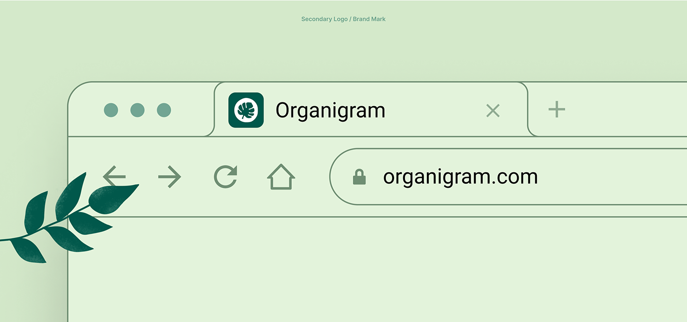
The “hand-drawn O with a leaf inside” is the brand mark and secondary logo.
Used for small spaces where wordmark will not be clear, readable, and hard to produce, like app icons, social media profile images, etc.


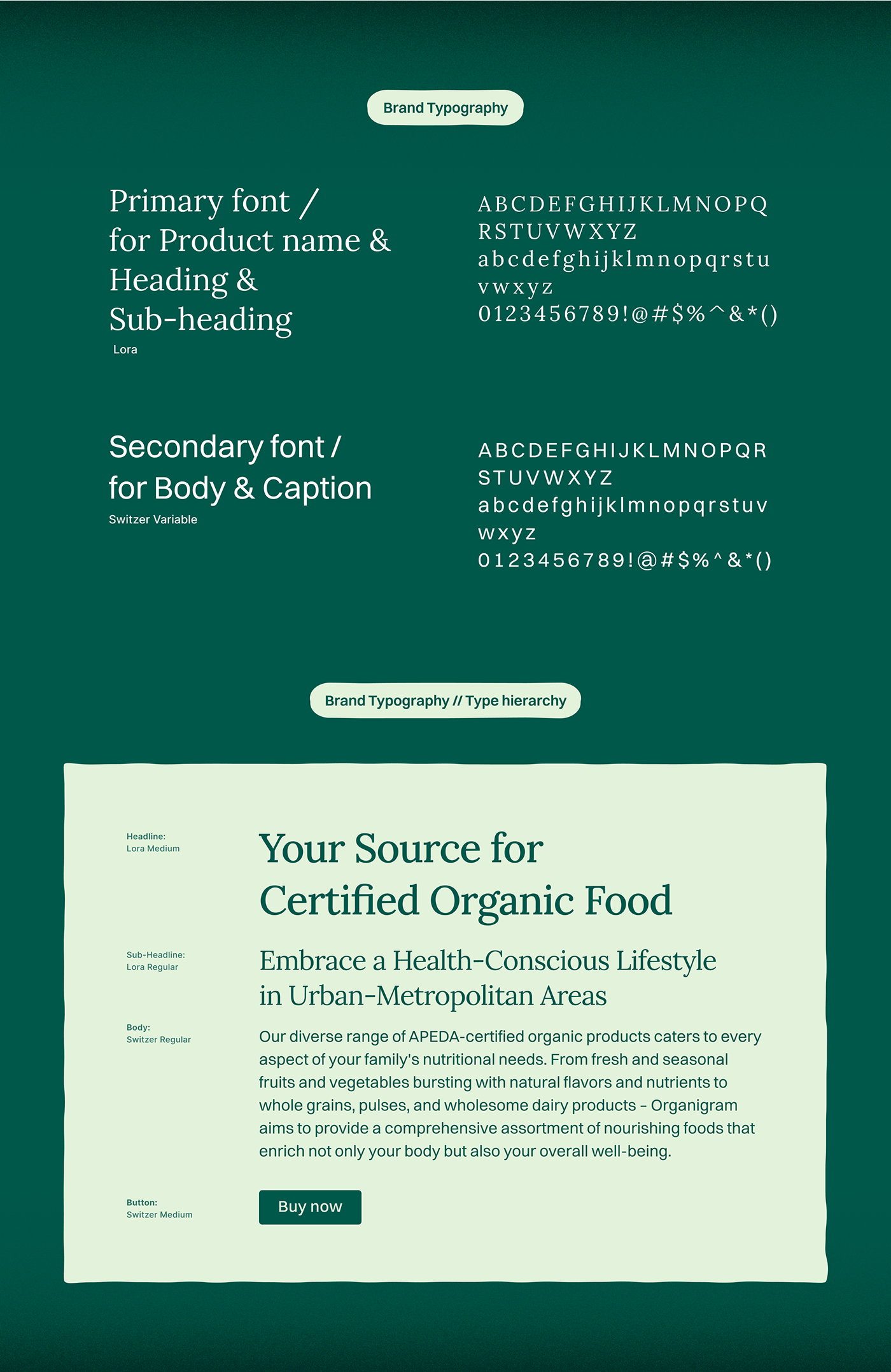
Lora is the primary typeface, offering a sleek and premium feel. It's carefully selected for headings, product names, and subheadings to convey a sense of premium.
On the other hand, Switzer is the secondary typeface, radiating a friendly and approachable vibe. Its clarity makes it perfect for larger bodies of content, particularly for body text, where readability is a
top priority.
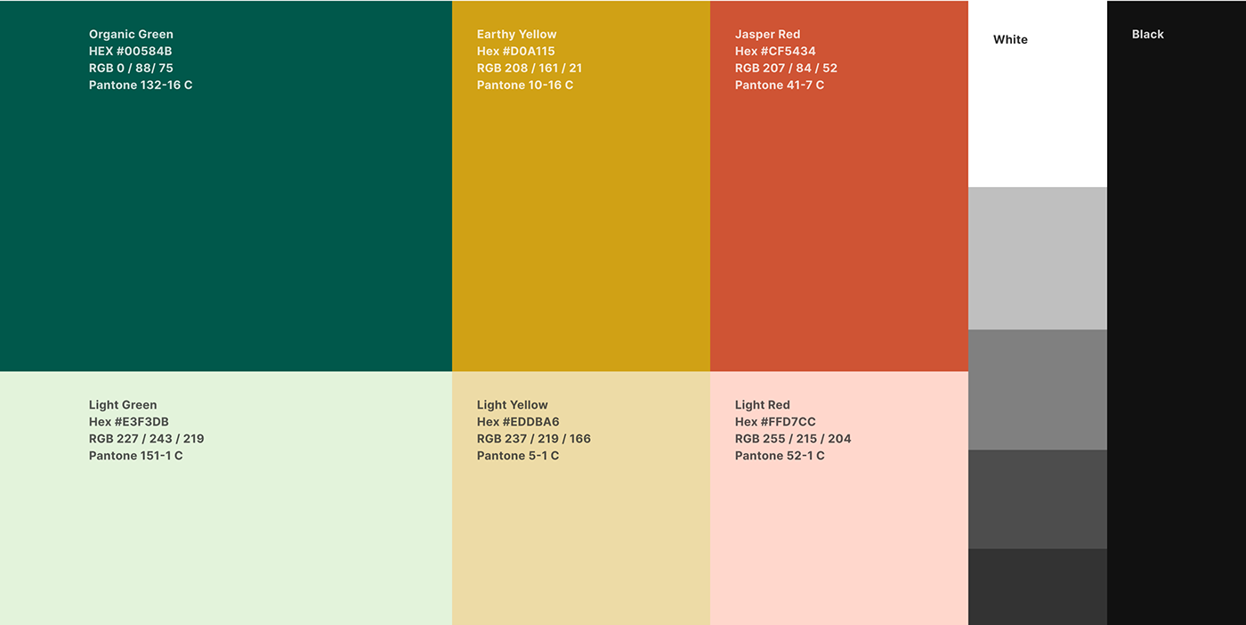
"Organic Green" is the primary color, representing the growth and connection to nature. Its lighter tone adds versatility.
"Earthy Yellow" and "Jasper Red" bring lively, cheerful energy and add warmth to it creating a welcoming atmosphere. Together, these make the brand visually appealing and balanced.
Consistent Brand Image Across All Touchpoints


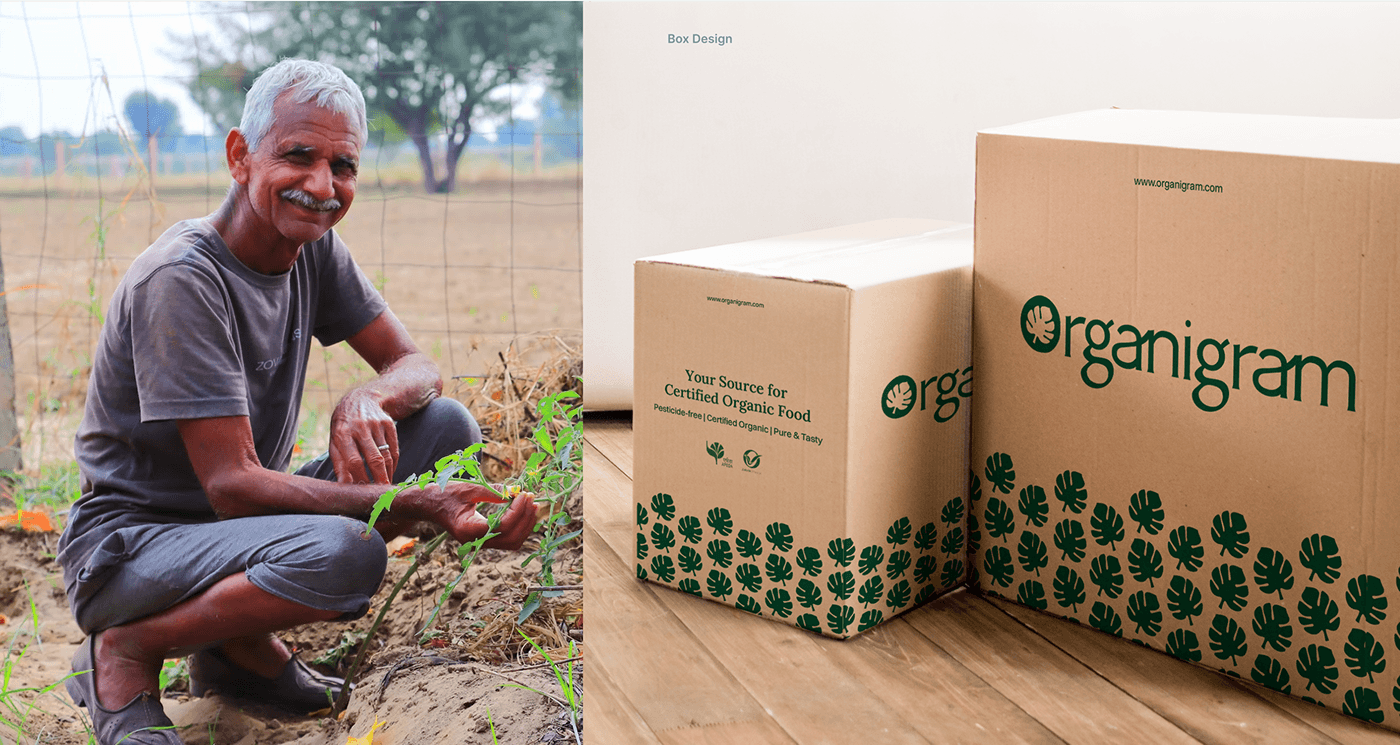


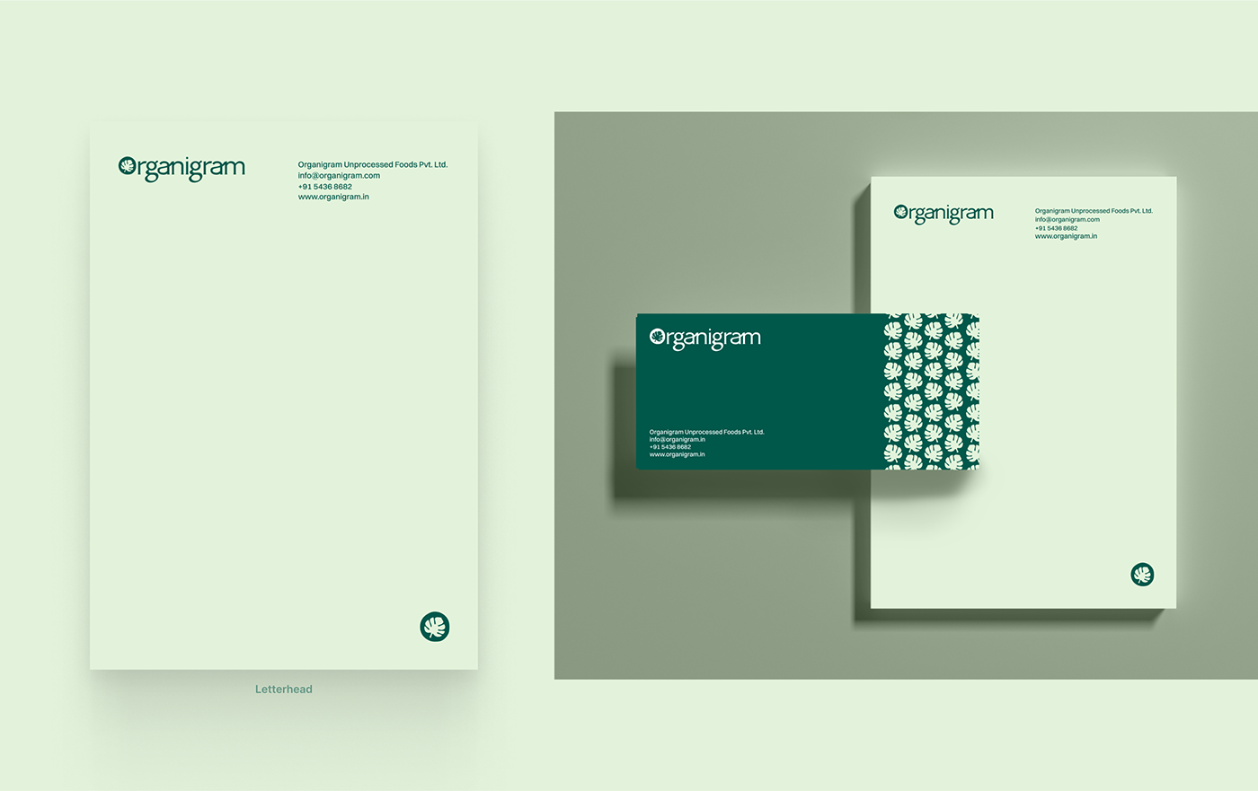
Brand Packaging
Packaging Design That Brings in More Business
Packaging is a major touchpoint of Organigram. Products will be packed in these bio-degradable bags.
We experimented with various packaging designs to leverage this touchpoint and reinforce the brand promise of product purity. Additionally, we aim to solidify the buyer's identity of choosing organic over non-organic food and connect it with Organigram's grand vision of saving the planet.
Also, used this touchpoint to build a strong presence in their minds, raise awareness about the company among others, and remind and reinforce what the brand uniquely delivers.
This contributes to building brand loyalty, repeat business, expanding the reach, and building a positive association with the brand.


Social Media
Social Media Templates
To activate Organigram on social media, we designed social media post templates to use across different social media platforms.

Client: Organigram Pvt. Ltd.
Brand Strategist: Muhammad Shahbaz
Creative Director: Muhammad Sarfaraz
Rezon Studio Branding Agency
Helping You Build
Heart-Winning Brands
rezonstudio@gmail.com


